Refer back to the satire handout on Blackboard and perform a brief analysis of your favorite satire. What is it commenting on? How does it work? Why is it funny, biting, or persuasive?
Due: Tuesday, April 3
Thursday, March 31, 2011
Tuesday, March 29, 2011
Journal 7
A weird thing to hate I know, but I hate stickers..especially when they're on someones face. It just has always grossed me out ever since I was little.
my picture wont upload but here's the link to my picture
http://www.google.com/imgres?imgurl=https://blogger.googleusercontent.com/img/b/R29vZ2xl/AVvXsEhIS5mSswKf2NhE4YtvgUktGKIvsFHQvpYugEz6e3MtJ-mYwvk2TLxPusFq9E2ioL2THLBeidxf8Xb84lCRL27r9usfYftBm3TVR1mWSdCdgfJB2gvipz9xmOcBuRMFvxQzSO2lI2gCyhOU/s320/sticker+face.JPG&imgrefurl=http://stampinsars.blogspot.com/2007_05_01_archive.html&usg=__50Sjo5_qv49aZBZMyUeNdF8Sze0=&h=300&w=320&sz=18&hl=en&start=111&zoom=1&tbnid=vgnZz0odl4C7WM:&tbnh=127&tbnw=154&ei=uQ2STYC7Jcq-0QGCiKXNBw&prev=/images%3Fq%3Dstickers%2Bon%2Bface%26hl%3Den%26sa%3DX%26biw%3D1339%26bih%3D571%26tbs%3Disch:10%2C2052&itbs=1&iact=rc&dur=335&oei=sQ2STe7fE-O00QGAqszNBw&page=6&ndsp=21&ved=1t:429,r:4,s:111&tx=97&ty=53&biw=1339&bih=571


Journal 7
My fear of heights is clearly shown by the man walking across a small wire atop a skyscraper.


Monday, March 28, 2011

Journal 7 post

Where I'm from, Kansas is the most hated team there is.
I'm transferring there next year and I can't WAIT to be a Jayhawk :)

Thursday, March 24, 2011

Journal 6 - Enos
IT WORKS NOW!
http://www.mt.net/~watcher/conspir.html, this is my ugly site because it looks like it was thrown together by someone who typically has little education or care about the topic at hand. Not only could I not follow what the website was about, but there were random pictures with links to ridiculous websites. It was also terribly unappealing.
journal 6
http://cmdshiftdesign.com/ilovesmekitty/- this is my ugly website i picked it as my ugly website because when i first looked at it i felt like i was going to have a seizure. i just has too much going on and is not very organized.
http://www.adebayoderu.com/- i chose this as my good website mainly becuase it kept my attention and it was spaced out and easy to follow
http://www.adebayoderu.com/- i chose this as my good website mainly becuase it kept my attention and it was spaced out and easy to follow
Journal 7

Create your own PostSecret card. Don’t worry about sharing your deepest, darkest secrets- you can make something up, or share something silly. You don’t have to create a digital masterpiece, or even put your text on top of the graphics. You can just post a visual, and type the accompanying text underneath. Have fun with this, but please try to keep in mind all that we’ve talked about in class.
To get you started, here's mine:
Due: Tuesday, March 29
Journal 6
http://www.centralstate.edu/index.php
I feel that this website is poorly designed because it doesn't stand out as a college website. From a distance I would think that it was an advertisement site because the layout is really simplistic. The colors used also are not that vibrant and do not draw attention. The color scheme is also disorganized because there is no set color pattern, which also throws off the image. Overall, the website looks pretty boring and if I were a prospective student I would not be impressed by it.
http://www.miami.muohio.edu/
I feel that this website is designed very well. The images and bright colors grab your attention right away and the pictures are in a slide show so that they are continuously changing. You can t tell right away that the website is that of a college and i can not be mistaken for an advertisement. The pictures shown are from a variety of aspects on campus so that it appeals to all types of people.
journal 6
www.weather.com
This website is my good and easy to navigate website that I chose. It has many cool colors that are easy to read, but it is colorful. It has many tabs on the top of the website for navigation. Then it has a search button saying, "enter zip, place, or city" for quick weather results.
http://www.angelfire.com/super/badwebs/
As for this website this is my bad one. It has many bright, difficult colors; such as yellow and orange. Its also flashing and the background is moving which also makes it hard to read!
visually appealing and unappealing websites
I think everyone will agree when I say that www.google.com is the most successful website recently, and there is a reason for that. It is not just because it is a search engine-- there are now dozens of those. Instead it is laid out simply instead of trying to add too many facets to their homepage. Since the homepage only has a search bar and their logo, it makes it virtually impossible for any one to not know how to use it. And then, when it brings you to your search, you are still not overwhelmed by pictures, videos, and colors. It is laid out in a logical fashion that even the least computer savvy would be able to figure out. That being said, I think that www.bing.com did it all wrong. They are attempting to do the same thing as Google, but they are missing the most important aspect of Google's webpage-- simplicity. On Bing you can personalize the background by clicking through different pictures of nature, and theres even a button that says, "if today had a song, this is what it would be" where you can play some song that Bing wants you to hear. You almost forget that it is a search engine, and that is why Google has been so much more successful.
Journal 6
http://www.ebay.com/. When i thought of a well put together website i immediately thought of eBay. They designed the site using wide variety of color, allowing the shopper to get sucked in to the website. Also they have small image screens all over the webpage showing with all the coolest gadgets that are the "new" thing. This website is very straight forward and allows for an easy experience for the viewer.
http://www.facebook.com/. When i thought of a poorly put together website not as far as technology and all the great communication this site created, but as far as the design of your personal web page. The background is white making it very bland, and boring to stare at. Also when first creating a profile not knowing how to find people, or figure out how to work the website makes for a problem. Although it is one of the most highly accepted sites in the world, it does not make it very easy to start your own.
http://www.facebook.com/. When i thought of a poorly put together website not as far as technology and all the great communication this site created, but as far as the design of your personal web page. The background is white making it very bland, and boring to stare at. Also when first creating a profile not knowing how to find people, or figure out how to work the website makes for a problem. Although it is one of the most highly accepted sites in the world, it does not make it very easy to start your own.
Wednesday, March 23, 2011
www.wikipedia.org
The moment I read the prompt for this journal I immediately thought of wikipedia as a very visually unattractive website. With its white plain white background and generic black and blue font it is not visually stimulating at all. I have always thought the creator of wikipedia could do much more to make it visually and rhetorically much more appealing, and probably get a lot more visitors. Honestly, it looks unprofessional and I think adds to its overall reputation as an unreliable source for research.
http://penguins.nhl.com/?navid=nav-teamnav-pit
I think this is a very visually attractive/stimulating and rhetorically appealing website. As a huge penguins fan I am a little bias, but it is a very professional and well set-up website. The colors and background textures of the website rhetorically add to connecting visiting this website to the team. It does have advertisement that doesn't really fit with the page, but advertisement is a given for most professional mediums. The first things you look at are your options to watch recent video's and updates about the team, as well as a box towards the right of the page that lets you know how they did in their most recent game and who they will play next. These visually attractive attributes catch your eye right away and inform you about the team whether you wanted to be informed or not. Rhetorically and visually this is a very appealing website.
Journal 6
www.yahoo.com
This is a very attractive website. The layout is phenomenal and its very appealing. I like how the site is very simple and user friendly while its also informative and useful. The left margin contains a diverse array of tabs describing the many features of the website. In the center, the headlines section catches the eye. Here, there are four interesting headlines ranging from sports to pop culture. There are features for every type of person. There are sports headlines, pop culture headlines, stock information, recipes and many more.
www.moeller.org
This is an unattractive website. This was the website for my highschool and i always had the hardest time navigating it to find what i was looking for. The layout is mildly appealing but overall its too complex. The information provided on the homepage is not useful. The most useful information should be the most accessible, not the other way around.
Progress
My progress this semester has been satisfactory in my opinion. I have liked most of the assignments. They have been interesting to me therefore it has been easier for me to write. I struggled the most with Inquiry 2 because I could not find a midway between content and outside material. I found what worked beat for me by the end of the Inquiry. I am looking forward to improving as the semester progress.
http://www.video2mp3.net/
This website is very unattractive, (however I download all my music from it, so guess it's not so bad). The color scheme is all over the place, there is no clear choice of colors and there is no interesting logo. The website is so poorly designed it looks like it is going to give your computer a virus. It looks so sketchy because not much thought has went into the wording and placement of any of the things on the home page. Also, when you convert a song, it takes you to an even worse website that has no relation to music. The mp3 converter site has so many advertisements, i can never tell what is the site or something else.
http://www.lillypulitzer.com/accessories+gifts/new-sorority-prints/icat/sorority/&bklist=icat,4,shop,accessoriesandgift,sorority
This website is really cute. THe colors and ads are very inviting. The use of colors, placement, and word choice accurately connect to the targeted audience. Everything goes together and has a nice unity and flow. Not to mention the clothes are beautiful....
Journal 6
Post a really ugly website, then a really attractive website. Tell me why they do and don’t work visually and rhetorically.
This website is not visually attractive at all. There are no colors. The entire background is black and all of the font is simply white. The writing is a boring font and very small. The only ounce of color is two little squares in the corner of each side that has their logo in it. The website is also very short, it's not even a full page which makes it even more unappealing.
This website is very visually attractive. The first thing you see are beautiful pictures of the Hawaiian islands, especially the clear, blue ocean. The pictures switch every few seconds to show the different amazing parts of the islands. The fonts used on the page are unique and in different colors and styles. Some fonts are in cursive which make the website seem even more attractive. There are also different tabs the viewer can look through and not stay on one page the entire time. The website tries to resemble what they are portraying Hawaii as, beautiful and exotic.
Post a really ugly website, then a really attractive website. Tell me why they do and don’t work visually and rhetorically.
http://cincinnati.craigslist.org/
This website is very unappealing to the eye. It doesn't strike you as interesting and by flipping to this website, I don't even want to explore more into it to find what I am looking for. All the website is is a bunch of blue words all the same size and text which doesn't appeal to me. It doesn't make me want to go any father in my search. I feel as if they need to add images and color to make this look better.
http://www.victoriassecret.com/
This website is very appealing to the eye. It uses light colors that all mesh well together. There are different sizes in the words to make certain words stand out to you more. The word sale is typed very big, and whenever there is a sale, it appeals to people. Also, there is a picture of a woman wearing Victora's Secret clothes to show what is being sold. To add to that, there is models modeling there clothes which makes you want to buy it after seeing the type of girls that model wearing it. I think this website is very appealing compared to the craig's list website.
Journal 5
http://www.cosmopolitan.com/
This website was rhetorically and visually appealing. It draws the person in by advertising and gives you glimpses of interesting story and makes the person want to read more. This website is also very interesting and has a lot to offer including advice/clothes/tips/personal stories and so on. It is also very colorful which draws the person in and makes them want to continue on their website.
http://americanhistory.about.com/
I randomly came across this website and found it very rhetorically and visually unappealing. It lacked color and you couldn't really tell what the website even was and how it was useful. It also was small font and nothing stood out to make the person want to stay on and learn more.
Journal 6
Post a really ugly website, then a really attractive website. Tell me why they do and don’t work visually and rhetorically. Due: Thursday, March 24
http://www.competitivecommercialcarpet.com/home.php?gclid=CKLv6Krt4qcCFQprKgodnxc1_w
This is a website I found about carpet that is pretty ugly. The background is completely white, plain colored. There are no animations either. The website is boring because it is trying to sell carpet, something not that exciting to begin with. Also the visuals are simple, plain colored, and boring. The text that is on the front page is a long paragraph, not something visitors would be interested in reading. Ethos and Logos are vague throughout this web page. They somewhat express
http://www.urbanactive.com/trainerfinder/websites/60092/home/index.html
This website is the one for the Fitness gym of Urban Active. It would be considered an attractive one. The colors catch the eye, they are bright. Their are images flashing on the screen, switching every few seconds. Their isn't any lengthy text, it is short and to the point. It is a website a visitor would be interested in looking around on, and discovering what this website has to offer.
Tuesday, March 22, 2011
www.purple.com - Really ugly. I am not quit sure what the purpose is for this website. It is just purple and I have received spam from them, but there are no links, pictures, titles, or words? Why is this even a website? It is so boring and it is all purple. This website is not very creative. It works visually in one way: the color of the website fits the name of the website very well.
www.steelers.com- Really cool.The background is sweet! It is pictures of fans one on side and on the other there are pictures of the players. Also I like that the website set out to find anything and everything on this website that you could possibly need to know as a steelers fan. The colors of the website are black and yellow, which is obviously fitting. The website is packed and there is not a lot of boring, dull, empty space. I could be bias because I am a steelers fan, but I do think this website is visually appealing.
www.steelers.com- Really cool.The background is sweet! It is pictures of fans one on side and on the other there are pictures of the players. Also I like that the website set out to find anything and everything on this website that you could possibly need to know as a steelers fan. The colors of the website are black and yellow, which is obviously fitting. The website is packed and there is not a lot of boring, dull, empty space. I could be bias because I am a steelers fan, but I do think this website is visually appealing.
jeans???


this clearly shows the sexual and gender roles. the guys are both very fit and you can see that they are just in jeans. more importantly you can notice the sex appeal with the girls hands being inside the guys pant and you can also notice she is looking right at the other guy who seems some what jealous. it is showing how men are very protective and always want to show their dominance. you can also see that the girl is in very good shape showing the other side of the spectrum.
Journal 6
Post a really ugly website, then a really attractive website. Tell me why they do and don’t work visually and rhetorically.
Due: Thursday, March 24
Due: Thursday, March 24
I think this add is definitely a shock value advertisement. It is a very simple add, color and production wise. The add is simple a picture of a burrito and text, all in black and white so the focus is both on the burrito wrapper and the text. It is interesting that the burrito is in a wrapper, Chipotle doesn't even show the actual food in the burrito, the audience has no idea what is in the meal or how appetizing it looks. The add is very sexual. Taking literally, it doesn't really make sense but the marketing technique is to an audience that would understand the sexual innuendo. It is a sexual joke directed towards women's idea of what they want in a man for sex, but the humor is more of a young men type of humor, the group that typically has low sexual jokes and fantasizes over sex.
http://www.google.com/imgres?imgurl=http://citizenchris.typepad.com/photos/uncategorized/2008/01/06/chipotle.jpg&imgrefurl=http://citizenchris.typepad.com/citizenchris/business/&usg=__J4nWfjgxmXS_hFx8l-xenieWzOw=&h=307&w=490&sz=98&hl=en&start=28&sig2=eVVbGlshbgL18RXn5wmT6g&zoom=1&tbnid=ZAXXv6n5g1qYGM:&tbnh=108&tbnw=173&ei=47KITcaUGI66sAPkhIn7Cw&prev=/images%3Fq%3Drac
Journal 5

journal 5
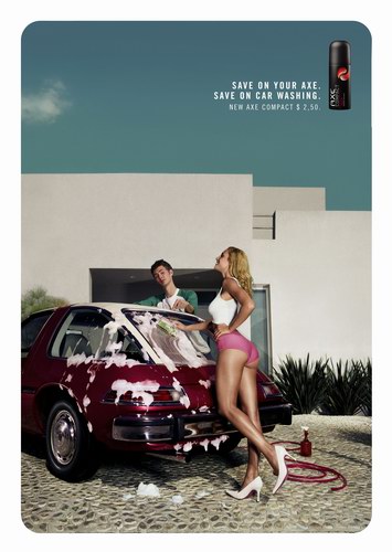
 This ad is definitely a sexual ad directed towards a mens body wash called Axe. This is sexual because it is a womens body that is literally dirty and "wash me" on her stomach. Which her stomach and chest is the focus of the picture. This attracts men to buy their product Axe by these sexual ads.
Journal 5
Spaced about journal 4, sorry! So far this semester I think I've strengthened by textual analysis a lot and learned that it can be use in more than just old literature but everyday influences. I've also learned that I can push myself and accomplish things I didn't think I would have normally been able to without challenges. I hope to continue this and strengthen my writing even further as the semester draws to an end.
Journal 5
 This ad is for Hollister Co. I find this ad very sexual. It makes women and men think that if they buy Hollister clothes that they will have the perfect boyfriend. In this picture it specifically says without words that if you have a body like this and are wearing Hollister clothes then you can get any guy you want or vis versa for girls. This ad promotes the values of sex or flirtation. This ad makes all the girls want to become something they aren't in real life.
Monday, March 21, 2011
Journal 5
This is an ad for adidas shoes. The actual ad states, "the first thing she notices....are your shoes" I was surprised by this ad because even something as simple as tennis shoes are being sold through sex appeal. The ad is saying that with a pair of adidas shoes girls will like you or want to have sex with you. The ad also depicts a vision of gender. With the girls underwear around her ankles, women seem promiscuous. Men are also shown to only be looking to have sex through every aspect of their lives, even the choice of shoes they buy. 
Journal 5

This is a commercial for a Mac computer. It portrays those who own PC's as high-strung, tightly-wound and a little nerdy. However, it portrays Mac owners as chill, easy-going, happy, and cooler. This is obviously and unfair stereotype but cretes an effective advertisement.
Ad
Find and analyze an ad that depicts a specific vision of gender, identity, or sexuality. What values does the ad project? Include an image of this ad in your journal, if possible.
This advertisement is for fantasy football. It is a sexual ad definitely aimed towards men. The people who made this advertisement know that generally men are more into sports. So naturally fantasy sports would be for men. And they also know that men like women, and even more they know men like women in lingerie. So they used this very attractive Victoria's secret lingerie model, gave her a football, and made her stare seductively to aim completely towards men. 
Journal 5

This ad definitely speaks to one gender and to a certain identity. This speaks to men, because for the most part men are more interested in the NBA then women are. Also it speaks to a sense of identity, because for many men the players depicted are iodls or role models. Each player depicted is also an NBA champion that has one a championship with there team. There are asking the audience who will be the next role model, and will you be there to witness it. I think this is a great ad, because it sparks interest for the future events, but it also makes us think back to who we idolize and role model.
Sunday, March 20, 2011
Journal 5
The value that is most obvious that this ad projects is love. This ad suggests that the perfume relates to love. Possibly that women who are in love and loving life wear this kind of perfume. The woman and man in this ad are both happy and in love. This ad attracts women to the perfume because the woman on it is beautiful and happy with a loved one. It might attract women who want or have a lifestyle similar to this woman on the cover.
http://www.google.com/imgres?imgurl=http://adland.tv/files/promesselarge.jpg&imgrefurl=http://adland.tv/content/decrypting-perfume-advertisements-friday-fun&h=874&w=642&sz=220&tbnid=u32NbdkfWAW2CM:&tbnh=146&tbnw=107&prev=/images%3Fq%3Dperfume%2Badvertisements&zoom=1&q=perfume+advertisements&hl=en&usg=__-tPjuabAeDGxqUmgwo8hWr09WXg=&sa=X&ei=R8CGTaH1IO6z0QH0rsG_CA&ved=0CCMQ9QEwAA
http://www.google.com/imgres?imgurl=http://adland.tv/files/promesselarge.jpg&imgrefurl=http://adland.tv/content/decrypting-perfume-advertisements-friday-fun&h=874&w=642&sz=220&tbnid=u32NbdkfWAW2CM:&tbnh=146&tbnw=107&prev=/images%3Fq%3Dperfume%2Badvertisements&zoom=1&q=perfume+advertisements&hl=en&usg=__-tPjuabAeDGxqUmgwo8hWr09WXg=&sa=X&ei=R8CGTaH1IO6z0QH0rsG_CA&ved=0CCMQ9QEwAA
Journal 4
Midterm Self-Assessment: Consider your progress at this point in the semester. What have you accomplished? What do you still want to improve?
At this point in the semester, I am proud of what I have accomplished in this class. I am proud of my grade and feel that I have put a lot of effort into each of my papers and projects. I have taken them seriously and have researched and read what was required. Something I would like to improve on is participating in class. I would like to focus on the next inquiry and continue with putting effort into my papers and hopefully ending up getting an A in this class.
At this point in the semester, I am proud of what I have accomplished in this class. I am proud of my grade and feel that I have put a lot of effort into each of my papers and projects. I have taken them seriously and have researched and read what was required. Something I would like to improve on is participating in class. I would like to focus on the next inquiry and continue with putting effort into my papers and hopefully ending up getting an A in this class.
Journal 5
http://www.yournextgift.com/images/2007/04/cosmopolitan_subscription.jpg
This is a picture of a magazine called Cosmopolitan. The cover of this magazine is displaying a skinny, tan girl with blonde hair on the front of the cover. This is playing into gender identity because it seems like in order to get onto a magazine cover you have to be skinny and pretty, without that, you are not on the cover, maybe not even in the magazine at all. Not only does this display gender identity on the front cover, it also displays it throughout the magazine. This magazine is about sex. All this magazine talks about are ways to please your man through sexual favors. Not only does it talk about that, but it also talks about how to make sure your man doesn't cheat on you. All the ways to make sure he doesn't cheat on you are to give him what he wants in sexual favors. This is a magazine that displays gender identity and roles all throughout the magazine. I believe it makes women feel less than pretty because they always have to live up to other girls expectations.
Journal 4
Midterm Self-Assessment: Consider your progress at this point in the semester. What have you accomplished? What do you still want to improve?
LATE:
At this point in the semester, I have accomplished being a better textual analyzer. I believe it has became easier for me to look at a piece of writing or media and I can analyze it in a better way than I could have done before this semester started. It's easier for me to look at these writings and figure out if gender is being used or what is going on in the paper and what the writer was thinking during the time of his writing. I need to improve on summarizing less and analyzing more when I critique a piece of writing. I tend to write about the text so the reader of my paper can understanding what is going on in the movie or book so they can understand my reason for how I analyzed the paper. Overall, I have learned more in this semester half way through the semester than I did the whole last semester.
Bowflex Ad
This ad is purposed towards males and sporting the male dominance and attractiveness scheme. Sexuality and attractiveness is one of the most prominent features of today's ads and this one in particular is meant to appeal towards the male desire to look defined. It not only depicts a man who has rock hard abs and an obviously toned body but it states that you can get into shape like this for only $10 a month. This ad contributes towards the male feeling of competition among other males. 
Saturday, March 19, 2011
Victoria Secret Ad
 This ad is a victoria secret ad that is trying to define sexiness. This ad is generalized towards women and is saying that in order to be sexy, you have to be half naked, with a good body, and pretty face. This ad is stereotypical and is trying to convince women that they need to look like this in order to get a guy's attention.
Friday, March 18, 2011
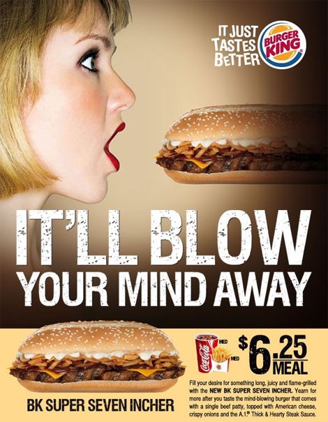 I choose this add because it does a good job of portraying women as sex symbols. This add does not make me think that Burger King values women. This was defiantly targeting men because I read some very angry comments from women on this when I clicked on this picture. It defiantly devalues women in general although it is funny it does disrespect women.
Bell Telephone System (Journal 5)

This ad is for telephones with extension chords (it is an old advertisement). It targets an audience of women, but more specifically, women who take care of their family by working in the kitchen. The ad is making an obvious gender statement that women should do housework rather than have jobs. For example, it says "picture the chops won't burn and the pudding won't boil over." By relating the ad to women who deal with these situations, the ad is suggesting that all or most women cook, clean, and make pudding. Another important aspect of this advertisement is the happiness shown on the woman's face. This happiness shapes a gender identity of a woman that loves taking care of the family and wouldn't want to work in an actual job. The women's apron also supports the idea that women are supposed to do housework such as cleaning, washing dishes, cooking, etc. By targeting this advertisement at women, the telephone company makes it seem as if all women should be spending the majority of their time in the kitchen.
Journal 5

I used this picture because i feel like this ad is definitely getting not only a messaged across but also it's playing out an image about Women at work. The image that they have is a image of a woman cleaning the floor and seeming pleased. She is in her working clothes at home. Women are often viewd as being at home taking care of the house and cleaning while men go and work and bring money to the house. Also the title "Fourteen Hour Wives of eight hour men" this clearly states the amount of hours a women would be working at home. It's also a lot more hours than it says a men will work. It's advertising Godl rush, and it gurantees the women to save time and enegery with they use Gold rush and be able to work and get out at the same amount of hours thei husband will work. The whole image definitely throws thei thoughts of a house women.
Thursday, March 17, 2011
Journal 5
Find and analyze an ad that depicts a specific vision of gender, identity, or sexuality. What values does the ad project? Include an image of this ad in your journal, if possible.
Due: Tuesday, March 22
Due: Tuesday, March 22
Monday, March 7, 2011
Journal 4 REPOSTED (Accidentally posted as Journal 3)
I think the best part of this semester is that I have a whole new approach in the way I think and analyze works of literature. I've been participating in discussions a lot more and overall I have just been more engaged in how I perform. I've been taking academics a lot more seriously and I think that everything's coming together for me. Sadly, I still have a lot of work to do in terms of shortening up the points that I'm trying to convey in writing. This is something though, that I feel I will always have a problem as a result of my attempts to be overly creative. I think as the semester continues I'll truly have a grasp on how gender roles ultimately shape identity in various components of society.
Friday, March 4, 2011
At this point in the semester I fear I have not accomplished enough academically. It has been a tough past 7 weeks. I have been extremely busy and have not exactly been the best at time management. In English specifically I feel I have gotten a new appreciation for the teacher, and how difficult it is to start up a discussion. I don't know if it is just this class or because it is at 9 30 am but it is hard to get students interested and caring about the topic at hand. Though my midterm grade is not bad, I still hope to achieve the grade I set out to earn in this class which is an A. I know I am able, I just need to buckle down second semester, not only with english, but with all my classes now.
Thursday, March 3, 2011
journal 4
i am proud of myself for getting the grades that i have up to this point and to be honest i am a little surprised that i have been able to do what i have done. i feel like i have come to look at texts in a different way and i feel like im always looking at what is masculine or famine. honestly i have already gotten everything i wanted to from this class and more so anything that i gain from now on is just an added bonus.
Journal 3 - Enos
I think the best part of this semester is that I have a whole new approach in the way I think and analyze works of literature. I've been participating in discussions a lot more and overall I have just been more engaged in how I perform. I've been taking academics a lot more seriously and I think that everything's coming together for me. Sadly, I still have a lot of work to do in terms of shortening up the points that I'm trying to convey in writing. This is something though, that I feel I will always have a problem as a result of my attempts to be overly creative. I think as the semester continues I'll truly have a grasp on how gender roles ultimately shape identity in various components of society.
Journal 4
So far this semester, I think I feel like I have done pretty well, but I know I can do much better. I think I am getting better at be more active in class and participating in discussions more. As a writer, I feel that I am getting better at analyzing texts, but I know I need to work on making better introductions that are more specific and less broad. Also, when writing rough drafts, I need to work on just writing whatever then editing later. Often I self-critique and edit as i write, which takes me longer to get out what i'm trying to say. The class as a whole this far has been pretty interesting and I have enjoyed our close readings. At this point in the semester, I hope to improve on being less restrictive when writing rough drafts because I feel like that is one of the sole reasons why I sometimes struggle with writing them.
Journal 4
I feel like this semester went by better than my last semester here in Miami overall. In this english class i definitely feel like i have done good paper and i can say that i am proud of my work that i have done. I feel like most of my work is very strong but i definitely feel like i still have some weakness when it comes to my organization in my paper. I do struggle with keeping up with the organization with my paper and still maintaining key points that i want my audience to focus on while reading my paper. I think that i could have done better in some of my paper that i have done but i have gotten very good grades in all of them so far. I think i have struggled a little more with the Inquiry 2 paper. And i can say that i have had some struggles and frustration was indeed in place. My last semester wasn't very good so i am very happy to see that i can still write beautiful papers.
At, midterm, I feel pretty good about english 112. I liked the first paper assignment along with the book fight club. I think I am doing okay but I'm very nervous about this large paper. Some ideas aren't clicking and things aren't coming as easy as usual. I want to improve on this paper and hope I get a good grade. I am planning on working on it during spring break ( =( ) but I want to improve on transitions and closing, as well as finding a personal style and not being too wordy. I think I have accomplished a good analysis of texts and working on being more confidant in my ideas of what things actually mean (I always think I'm missing something or am totally off). But overall, I think things are going okay and I hope to keep my grade up!
Wednesday, March 2, 2011
Journal 4
This semester has been going very well for me! I feel like both of the Inquiries so far have been great. I loved the book Fight Club and I think our classroom discussions of it have been helpful to follow it. Focusing on the process of composing an essay has also helped me in writing better papers. I really like that this class focuses on that aspect. With regards to my writing, i think that i can improve in the structure of my papers. I know what i want to write about but structuring it in a way that helps the effectiveness of my argument is something i need to work on.
Journal 4
At this point in the semester I definitely want to get more organized with my assignments in this class. Pledging takes up a lot of time and it does not help my cause to wait until the last minute to do all of my assignments. I want to start working on my papers multiple days in advance so I don't have to cram. On the positive side I have learned some new techniques to write with. I have enjoyed reading Fight Club and I am opening up my way of thinking to new interpretations.
Tuesday, March 1, 2011
Midterm Assessment
I think after taking English last semester I have improved on organizing my papers. I have always had plenty to say I just did not always have a way to organize it all. I think I have somewhat also improved in my grammar area that I always struggle with! I take a lot more time reading and rereading my papers to edit grammar mistakes. It also helps to have someone else check your paper as well! Which, sometimes is easy to do and other times I cant find anyone! I still think I have a lot of improvement to do in the grammar area, as well as organization. There is always room for improvement, well that's how I feel at least. I also still want to improve on cutting down my papers a bit. When I am giving a page length I would like to be able to stick to it and not run over at all. BUT, I am taking one step at a time!
Journal 4
This semester, I have gained many skills in my writing. I have learned how to take a close reading and relate it to the "bigger picture" of the novel/literary work, like we did in Inquiry 1. This was the first time I've had to tie a close reading back to a central theme in a formal paper. This skill will definitely come in use in my future, especially in my writing, because it is important to have textual support to prove the analysis. Another important skill I feel I have improved this semester is being able to focus in on a single theme of a literary work, specifically, Fight Club, in Inquiry 2B. This is an extremely complex novel, especially because of its random events and numerous themes. It was difficult for me at first to choose a single theme because of the many overlapping aspects in the novel and because I was unsure what was actually happening at certain points in the novel.
However, I have much to improve on for the remaining weeks. I feel as if my writing is unclear at times and I want to improve my clarity. Also, I want to work on the organization of my papers because the way a paper is organized greatly affects the quality of the paper, and I usually don't know what way will be most efficient in getting my ideas across to the reader.
Journal 4
During english 112, I feel like I have accomplished becoming a better writer. For inquiry one, I learned how to analyze a novel and that there was more to it then just summarizing the book. I learned about gender roles and how society stereotypes males and females. For inquiry 2a, I learned how to look for articles and find reliable sources to incorporate into my paper. I am still working on inquiry2b and am discovering different ways to write a paper and through research I can include more to my topic. My topic I am working on now is inquiry2b and I am writing a paper on "Dear John." I am learning a lot about war and relationships through this book and this love story is about a relationship that has fallen apart because of war. I am also learning more about September 11th through researching it and I didn't know I could possibly learn anymore about that event, but I am learning little details. I still want to improve my writing skills and be able to have a strong argument for inquiry2b.
Journal 4
What have you accomplished? What do you still want to improve?
So far this semester, I feel like I have accomplished a lot. Through the first inquiry I have learned more about how to do a close reading and truly how to analyze a novel. Before completing that assignment I mostly knew how to summarize a text without looking deeper into the meaning behind the novel. As I continue writing my inquiry 2 I am learning how a culture and a time period shape a text and how knowing the background of a piece of work can help a reader to understand the meaning behind it. However I still have a few things I want to improve on. One important thing is my workshopping skills. I have the most trouble fixing my first drafts. I feel like once I write a paper I can't find a better way to follow the prompt or rewrite my essay.
So far this semester, I feel like I have accomplished a lot. Through the first inquiry I have learned more about how to do a close reading and truly how to analyze a novel. Before completing that assignment I mostly knew how to summarize a text without looking deeper into the meaning behind the novel. As I continue writing my inquiry 2 I am learning how a culture and a time period shape a text and how knowing the background of a piece of work can help a reader to understand the meaning behind it. However I still have a few things I want to improve on. One important thing is my workshopping skills. I have the most trouble fixing my first drafts. I feel like once I write a paper I can't find a better way to follow the prompt or rewrite my essay.
Journal 4
Midterm Self-Assessment: Consider your progress at this point in the semester. What have you accomplished? What do you still want to improve?
Due: Thursday, March 3
Due: Thursday, March 3
Subscribe to:
Posts (Atom)